Don’t Guess—Find Out What Works
Affordable ways to make sure your direct response fundraising is informed and ready to perform
Whether you are looking to improve results on your direct response program or turn a downward spiral around, effective and affordable testing is your organization’s best friend. It can improve how you tell your stories and connect with donors—and can grow fundraising results exponentially.
Often we recommend that testing begin in the digital space. In this channel results are trackable in real time, tests can reach a wide audience quickly, and can be done without a large budget. For example, by utilizing Facebook ads, you can easily create a custom audience of your direct mail supporters or a pool of new prospects patterned after your active donors. These audiences can then be shown a variety of different creative options to test messages, images, or offers before rolling out on cultivation or acquisition communications.
However, the digital channel is not the only area where you should be testing. When trying out a new offer or new package, your direct mail should also be tested before doing a full-fledged mailing. Here are some of our recommendations for testing.
- Test is the carrier or teaser. A strong carrier and teaser can affect how many people open your letter.
- Code your control and test packages to ensure that you are able to track and review the results. Unlike digital, direct mail results are not instant and we recommend evaluating the results after 90 days to determine how the test performed.
- A few other great areas to test are ask amount levels, the order in which the asks are listed, photos, story content, style of the package . . . the list is endless.
The most powerful testing option combines your fundraising channels. Measure several options in the digital channel to gather information, and then use your winning combinations as test packages in your mailing.
Testing Examples:
Carrier Test
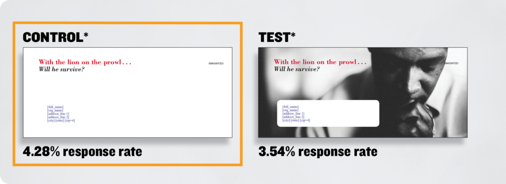
Below is a carrier test that was executed to determine if a carrier with an image or a carrier with just a teaser increased open and response rate.
The Results:
In this test, the Control was the clear winner.
- Control: Without image 4.28% response rate
- Test: With image 3.54% response rate
Outlook-Style Test
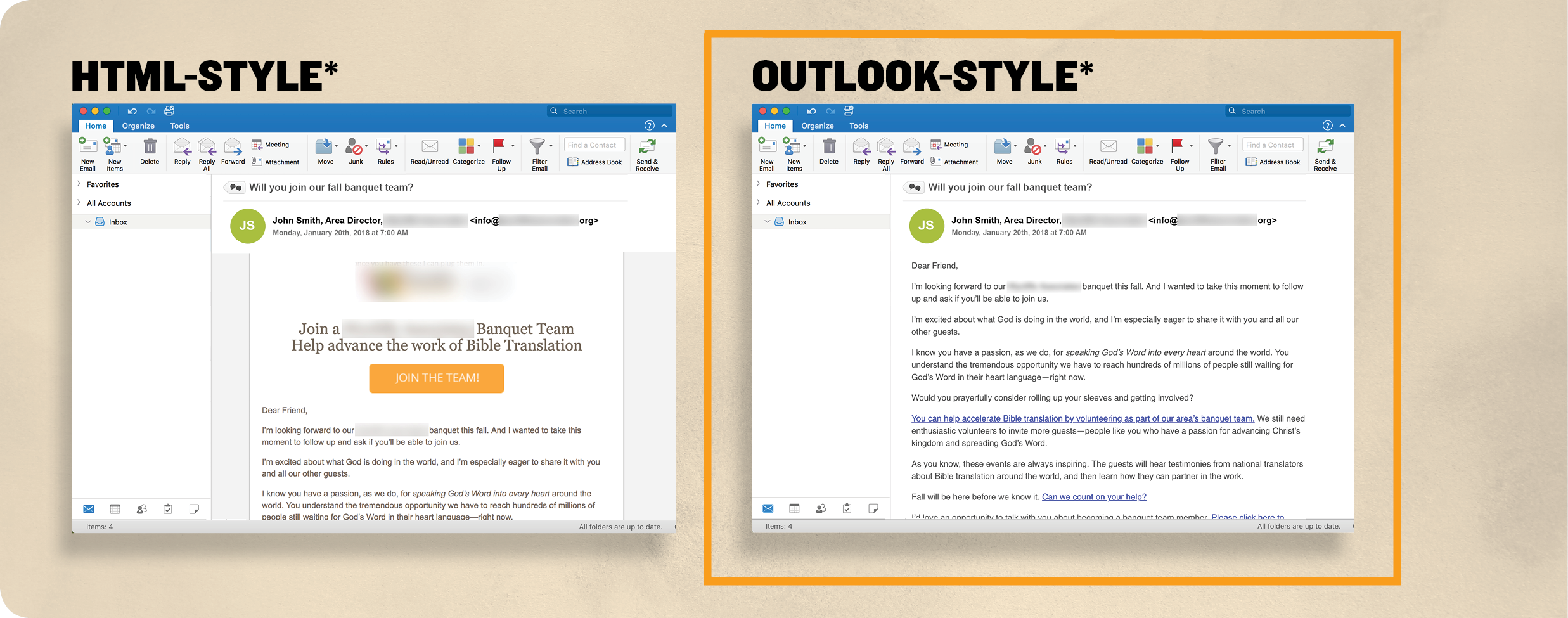
Interested in finding out a way to boost event registrations for your organization? Run an online test like the one below to find out if your donors respond better to a fancier HTML-style email or a plain Outlook-style message.
The Results:
The Outlook-style message won
- Increased click rates by 73.6%
- Boosted event registrations by 60%
Based off of these results, we recommend continuing with the plain, more personal messages for future event invites.
Related articles
-

More Than Just Work
As a young Christian professional navigating the conundrum of aligning my beliefs into a purposeful career, I’ve been blessed to…
-

What to Think of Artificial Intelligence and Its Impact on Fundraising . . .
In trying to summon an image to represent our theme for this issue of Donor Focus, I found myself drawn…
-

Fundraising Meets Artificial Intelligence
In this article, we’ll explore the captivating realm of AI-powered fundraising efforts—the boundless benefits and intriguing challenges that arise when…


